Introduction
Before I started creating the prototype for this micro-interaction midterm for an email interface, our cohort and I had a lecture and a chance to present to the class and professor for feedback. When presenting where I am at in the project, Professor Maxim was questioning whether or not my read/unread micro-interaction was a feasible feature to add, to which I responded with no. He said that it was too simple and not a strong case to make a project on and that I should think of other micro-interactions to do. That day I presented my 3 micro-interactions proposal which was a drag&drop sorting feature, smart tagging, and the read/unread I mentioned earlier. Professor Maxim then told me some suggestions that I can try tackling and that was a time-sensitive feature integrated with the smart tagging. I thanked the professor and my cohort for the feedback and went to work on implementing the new features.
Context
Technological Advancements
Increased internet accessibility and mobile technology have led to a surge in email volume.
Remote Work Culture
The shift to remote work has increased reliance on email for communication among dispersed teams.
Information Overload
The digital age has resulted in a constant stream of emails, necessitating efficient organization solutions to manage incoming messages effectively.
Problem I am focusing on:
Inefficient email organization leading to productivity challenges.
Research & Methodology
While researching for features and interfaces to use, I took a look a look and studied at Windows Mail and Gmail for my references. I liked how Windows mail has a simple yet effective interface which I really love using (it's my daily mail client). What I enjoyed from using windows mail is that it's not a bulky/lengthy client and simple navigation tools I appreciate. For Gmail, I love that they have many categorizing tools built in the client, tools such as their primary inbox, promotions, and social tabs to separate the bulk of incoming emails users receive daily. Another feature I enjoy using form Gmail is their labeling feature, which I was inspired by.
Precedents and competitors
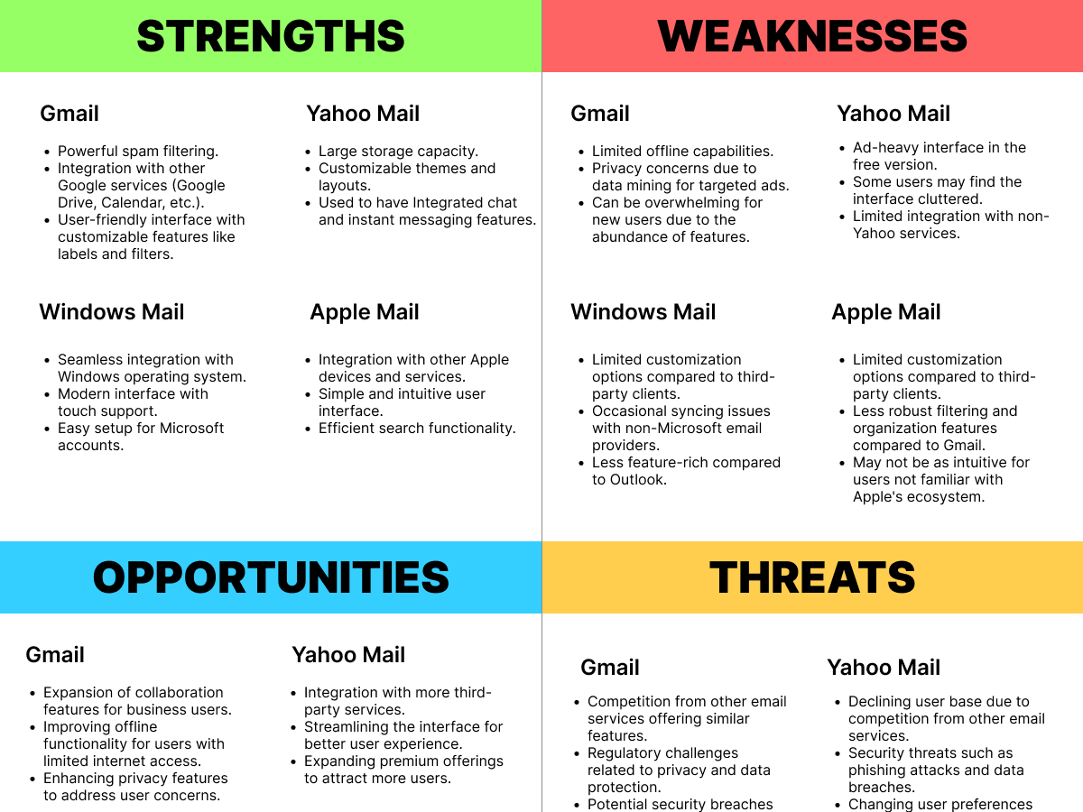
Some weaknesses from the SWOT analysis can be in Apple mail's not having an intuitive design for non-apple users.
When I was brainstorming on how to implement time-sensitive emails to the smart tags, I thought of another feature that I wanted to bring to life, and that was the filtering function. I began by creating the look and feel of the email interface with an idea I had in mind during the lecture, which I translated into a sketch.
With this, I spent most of my time creating the UI on Figma and was happy with how it turned out.
Happy with the interface, I wanted to check off my to-do list to prototype one by one, and that order would be Smart Tagging, Drag n Drop, Filter, and Time-sensitive. When thinking of ways to implement smart tagging, I wanted to show users that they are in the smart tagging mode and make sure that users are aware of this and created a screen with buttons confirming if they wanted to proceed with their action.
Smart Tagging & Time-sensitive Feature
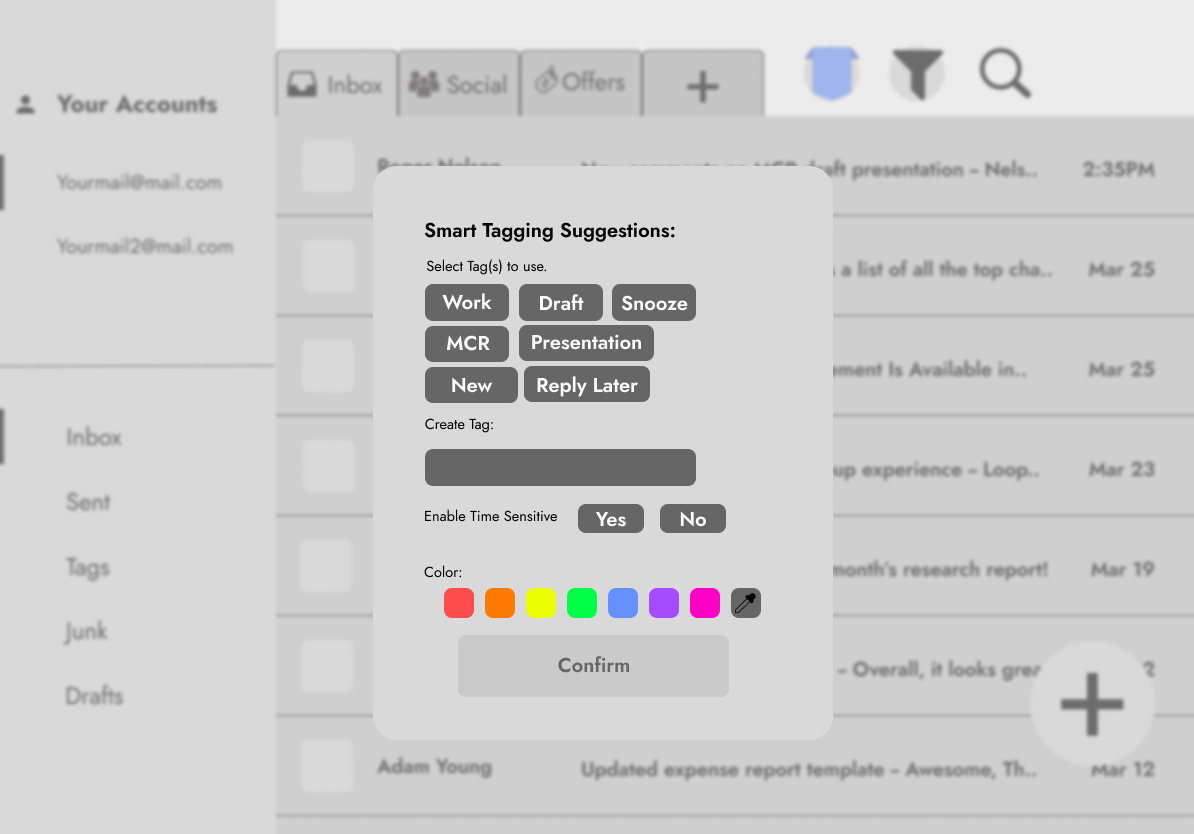
Once users are aware and want to initiate the action, users are then prompted to a screen where the system scans the content of the email and uses AI to suggest some tags users might want to use. The email client will show users what is clickable in this tagging feature with a blue box surrounding the emails. Users can also customize tags by typing their own preferred tag name in the text box provided. In this tab, I also thought of adding colors as customization for users to categorize to their heart's desires.
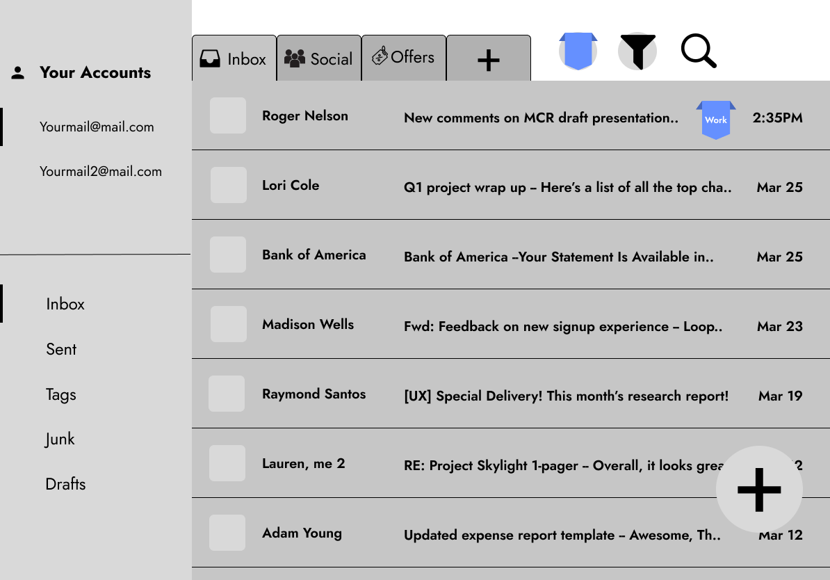
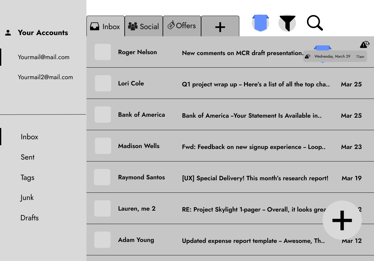
Once users are done with customizing their tags, they are then presented with their mail with an icon with or without the time-sensitive tags alongside the newly created smart tags. Users can click on the tag to initiate another feature which is to edit or remove the tag, which brings them back to the customize tab. Users can also hover over the time-sensitive icon to check when the mail is due.

Drag & Drop Feature
For drag & drop, I had to revisit my test mockup to see how the mechanics of it would work. I tried implementing it on the client so that users feel natural when dragging and dropping emails. I looked up a simple tutorial to help me with this feature as I have no prior experience in creating this interaction. Although not the best-looking interaction, I say it worked quite well and did the job like I wanted it to. I think for future exploration, I wanted to learn more about how to create a smooth-looking animation so it can look legit.
Filter Feature
After I am done working on those features, my last hurdle was to create the filter feature for the mail client. This was just a bonus task that I wanted to experiment and add because I felt like I would love to have a filter feature. I began with researching on how other clients have been using their filter function and I thought I wanted to use that as my inspiration. I created a tab when users click on the big filter button, where users can find categories to sort their emails with. Users can click on it and they can see the client filtering and sorting out emails based on the filter chosen,
Conclusion
In conclusion, I think this midterm project was way harder than I expected it to be. I think I underestimated the complexity of designing micro-interactions and overestimated my abilities as a UX/UI designer. I came in the project thinking it was going to be easy but I was wrong, and this was a valuable learning experience for me and I have gained even more respect to UX/UI designers for being able to do these as their profession.
Looking back, I would take more time to research the methodologies and technical skills needed to bring my ideas to life to execute them better for future projects. This process has been challenging and rewarding at the same time for me and will continue to develop my skills as a UX/UI designer. I would also take more time into building my flowcharts, as they are really what makes the experience alive. It's a challenge for me to create flowcharts because my brain works backwards to make sense of the flow. I would try to visualize the flowcharts more and see where it makes sense for the user more, thus making the experience seamless.
Thank you for reading this design process until the end and looking more into my thinking!


