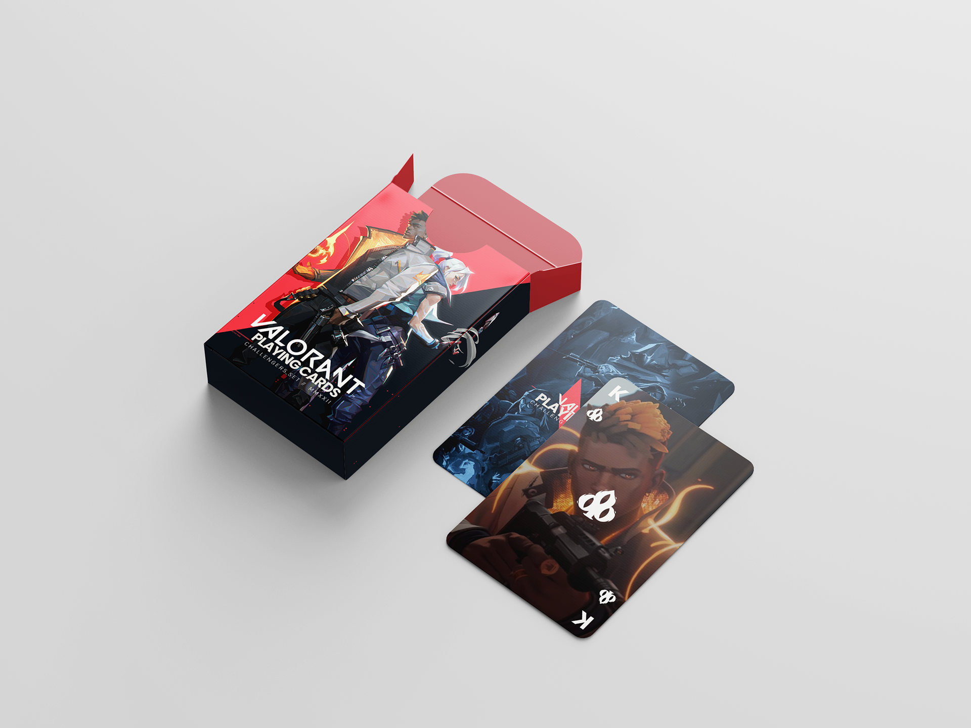
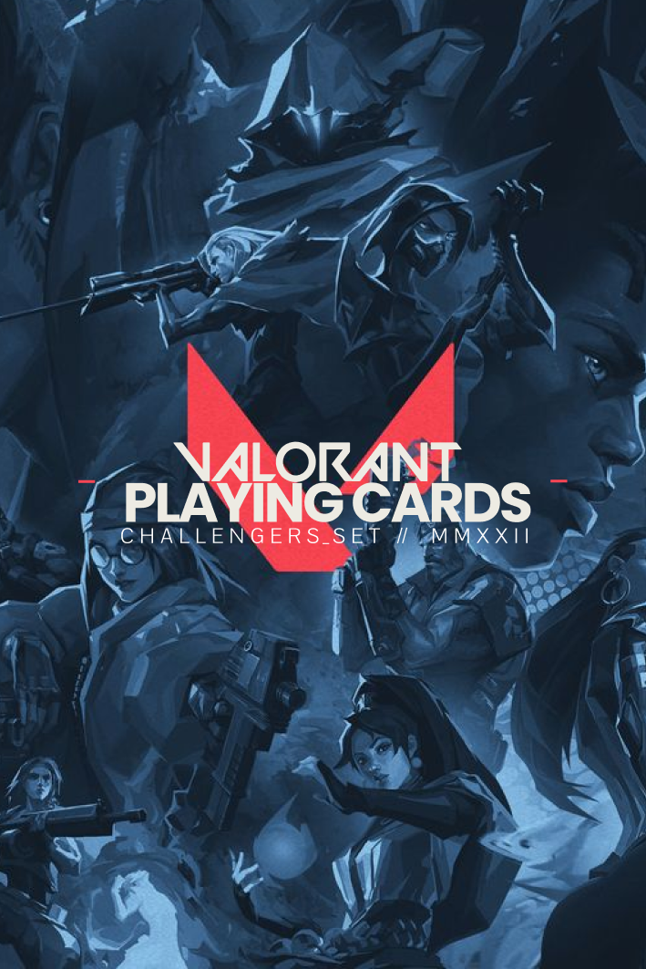
Valorant Playing Cards
Description: A unique set of playing cards and packaging designed as a special box set, inspired by the popular game Valorant.
Design Brief: Design a special set of playing cards and packaging for a brand or create a new brand.
Academic Project
Role
Graphic Designer, Product Designer, Project Management
Year
Fall 2021 (16 Weeks)
Team
Individual project
For this project, the goal was to create a visually appealing set of playing cards inspired by Valorant's in-game elements. The challenge was to incorporate the game's theme and characters into the design while ensuring a seamless and enjoyable user experience.
OVERVIEW / PROJECT CHALLENGE

Problem
Designing a set of playing cards that captures the essence of Valorant.
Insights
Leveraging Valorant's signature theme and iconic characters is crucial for player engagement.
Solution
Creating custom symbols inspired by Valorant's icons and designing cards that showcase the game's aesthetic.

RESEARCH + PROCESS

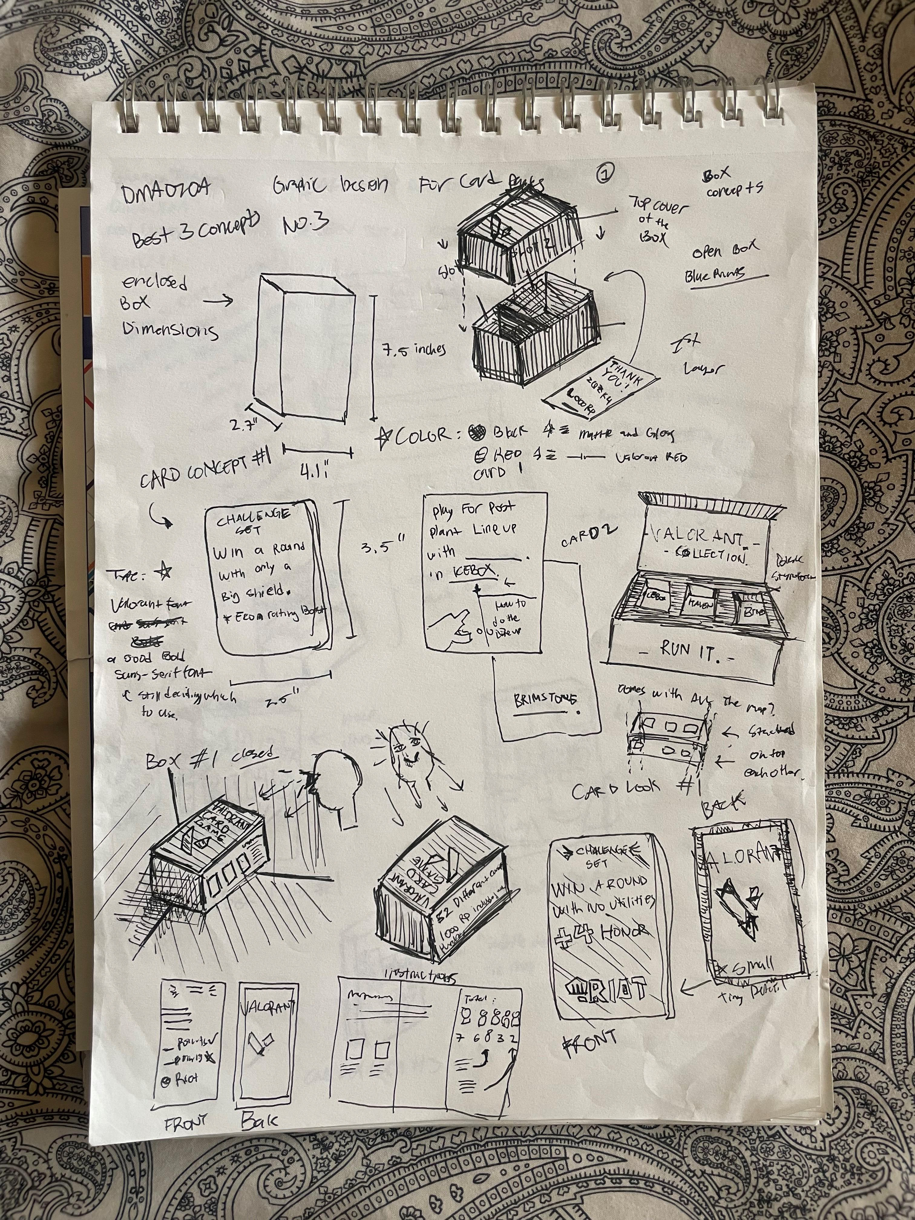
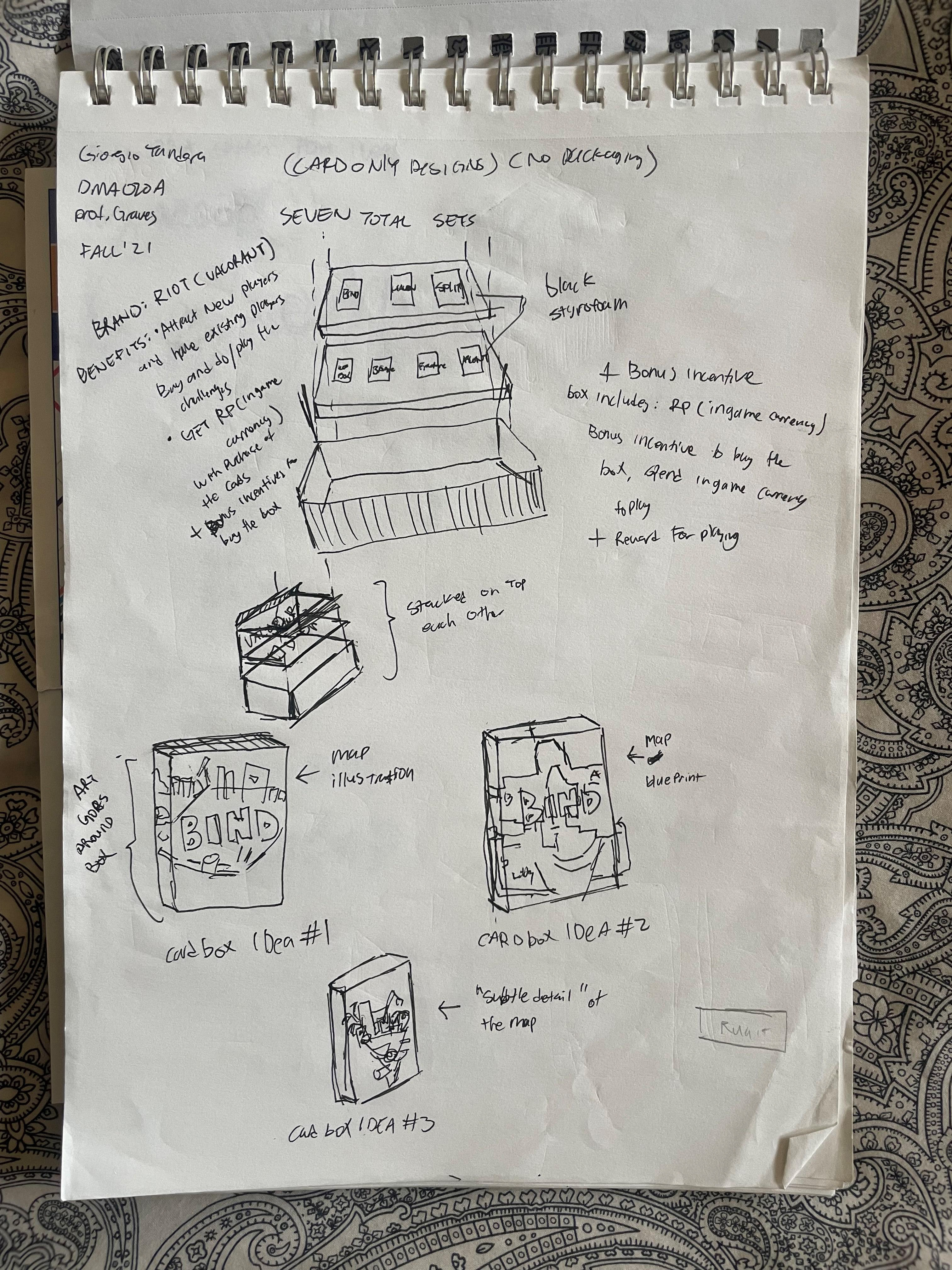
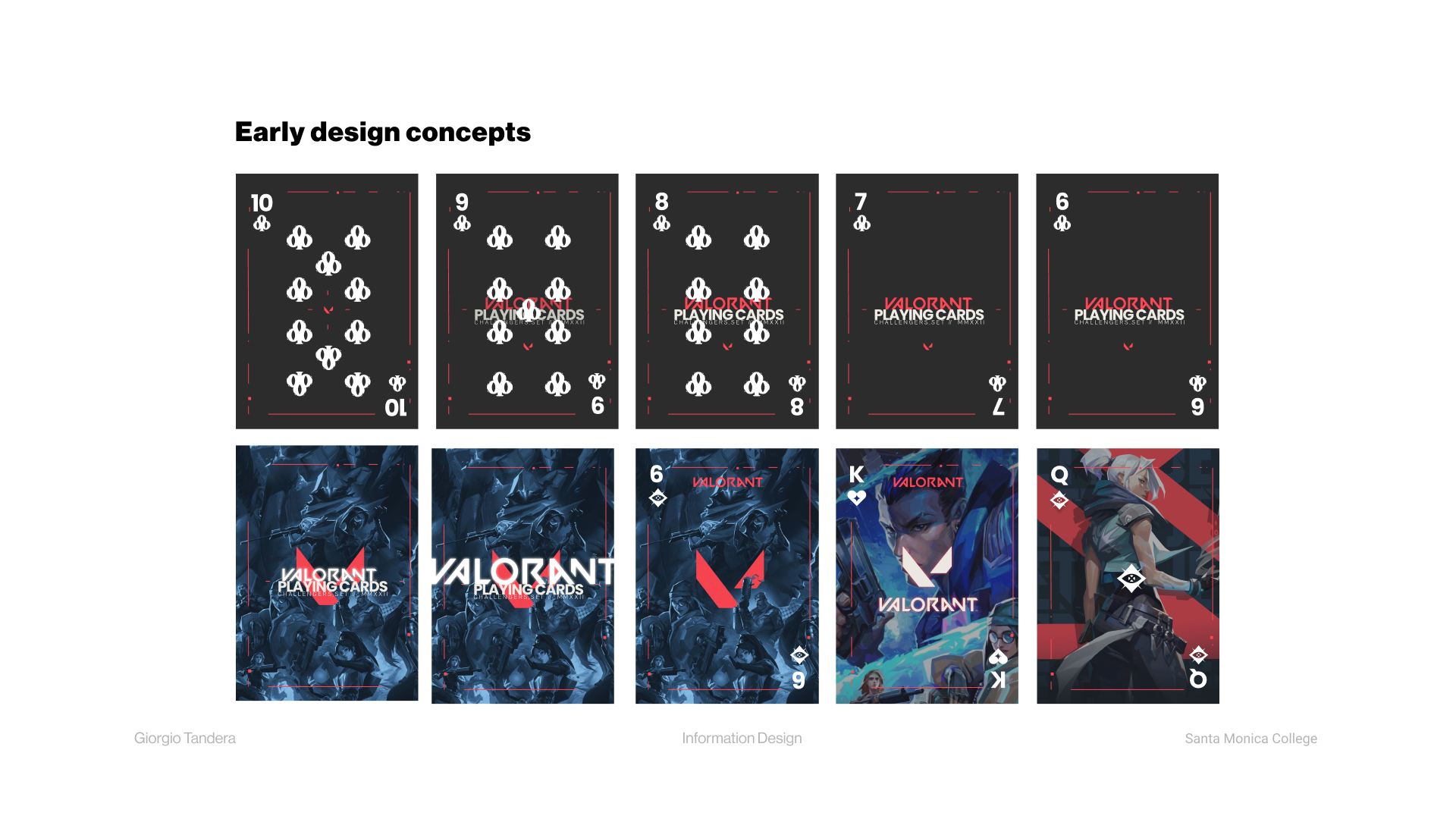
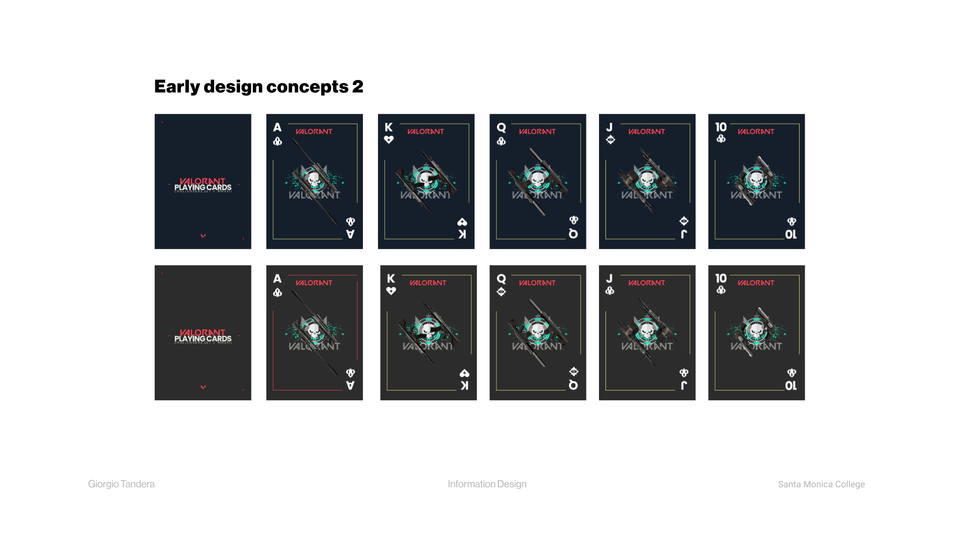
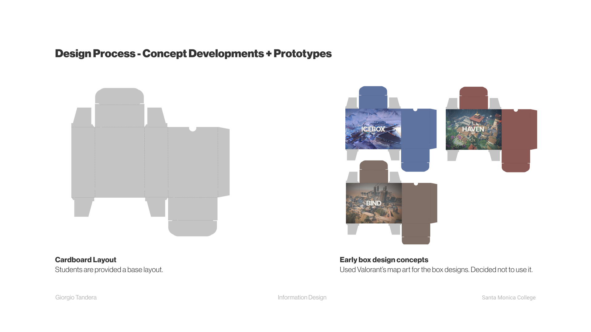
Early Design + Concept Sketches
Observation/ Desktop Research
Studied standard card box dimensions and found useful information:
Item Display Dimensions:
Item Display Dimensions:
2.5 x 3.5 x 0.75 inches”
Item Dimensions LxWxH:
0.75 x 2.5 x 3.5 inches
The cards measure
3.5" x 2.5".

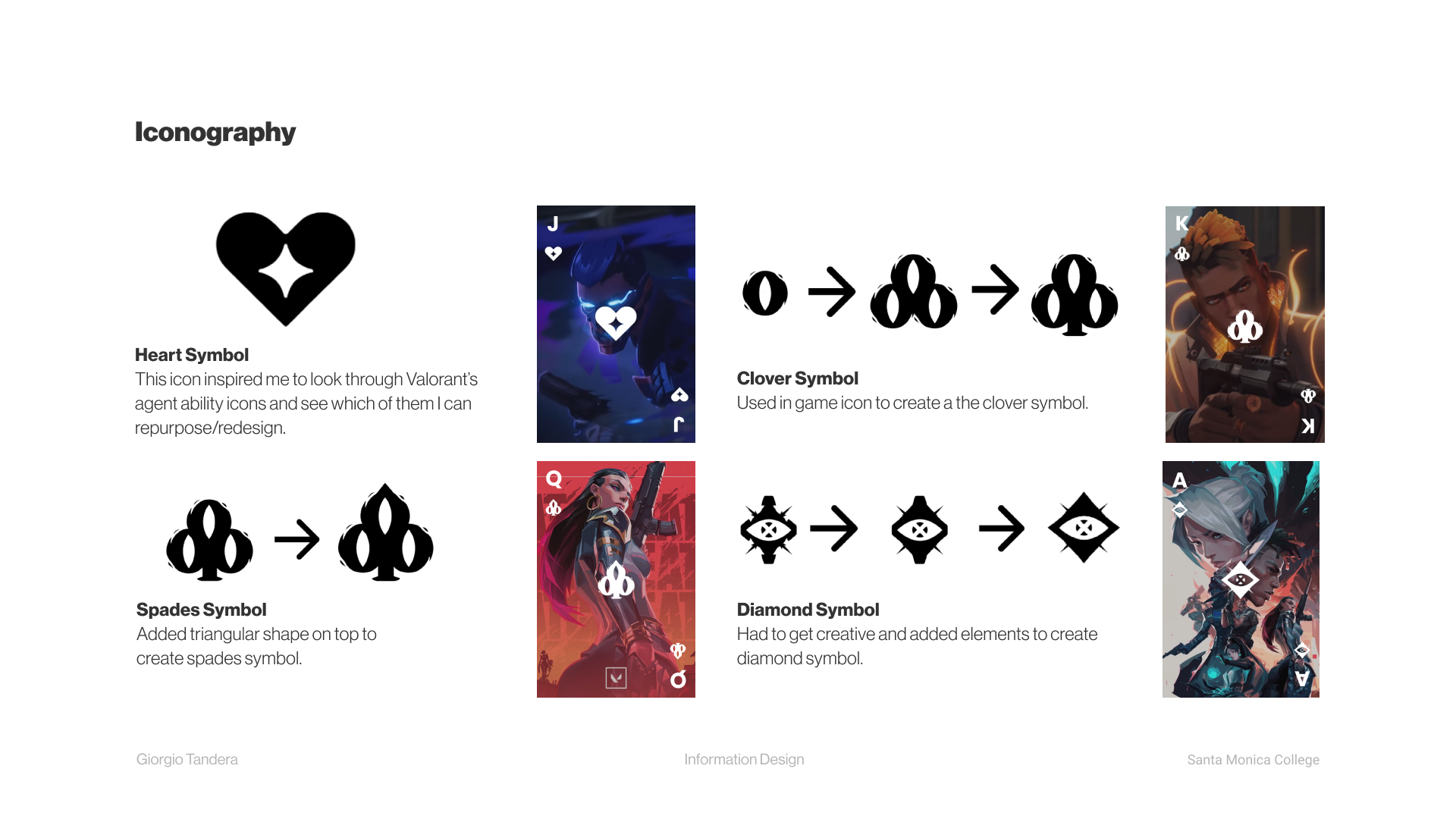
Identified a heart symbol from Valorant character "Sage" for the first theme.
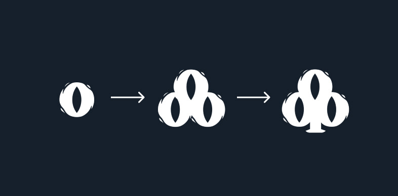
Analyzed and adapted the clover icon using Valorant's "Leer" circular eye icon.
Iteration

Incorporated a triangle shape for Spades, inspired by Valorant's Spades symbol.
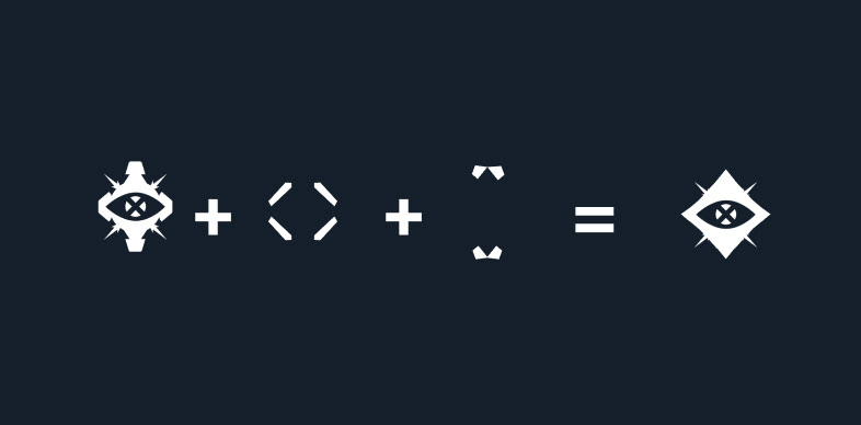
Explored and adapted a similar icon for the challenging Diamond shape.
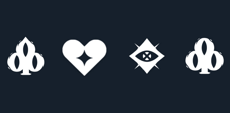
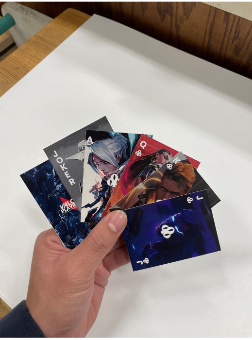
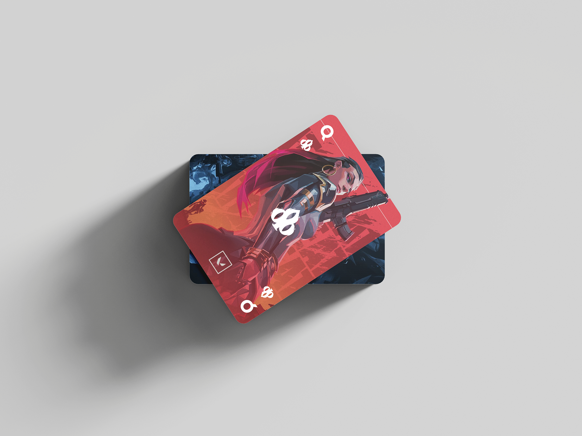
Spades, Heart, Diamond, and Clover icons.
With this, I got all 4 playing card icons made from already existing in-game icons.
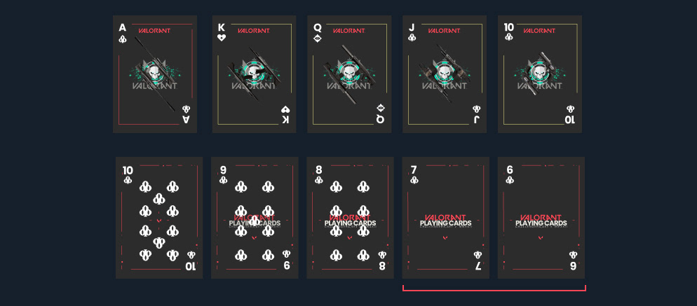
Experimented with designs for the card faces, iterating until a suitable Valorant-themed design was achieved.
The cards highlighted in red is the final design chosen.
Theme Development

Experimented with designs for the card faces, iterating until a suitable Valorant-themed design was achieved.
Conceptualized a dynamic back design inspired by Valorant's signature red lines.
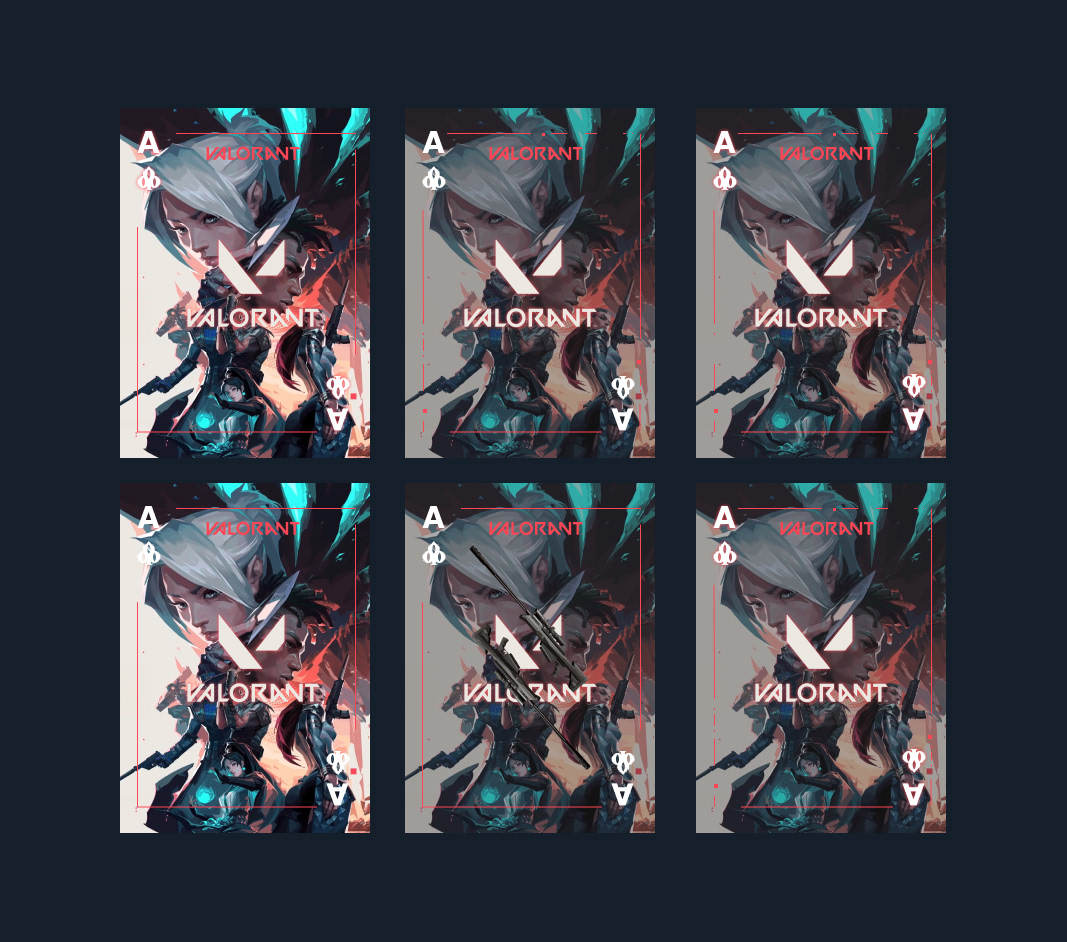
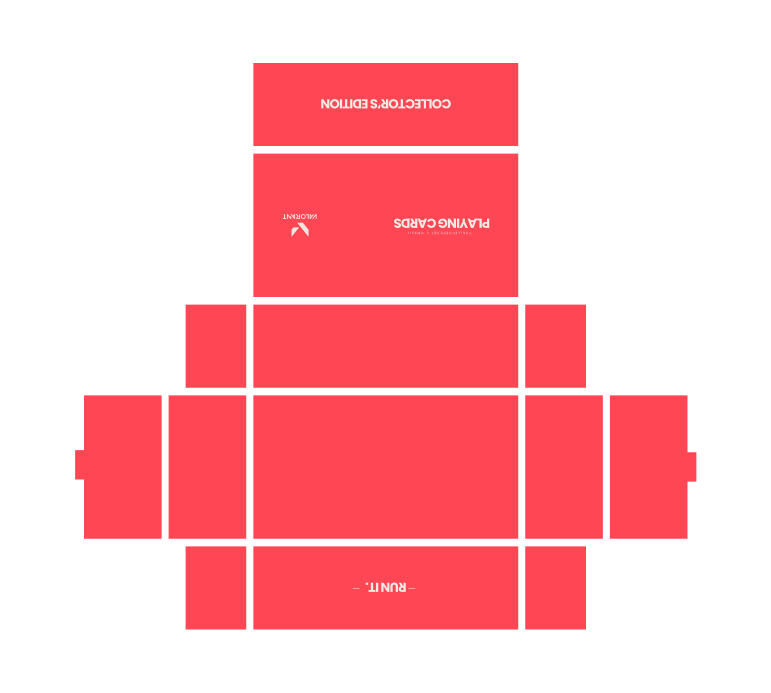
In exploring Valorant's wealth of captivating artworks, I found myself inspired to share this visual richness with a broader audience. This insight motivated me to feature and integrate the exceptional art crafted by the Valorant team into a distinctive "special" set box.
Eager to create something truly extraordinary for this set, I recognized the uniqueness of the "royals" with their captivating graphic elements portraying kings and queens. This realization became a focal point in capturing and conveying the essence of specialness in the design.
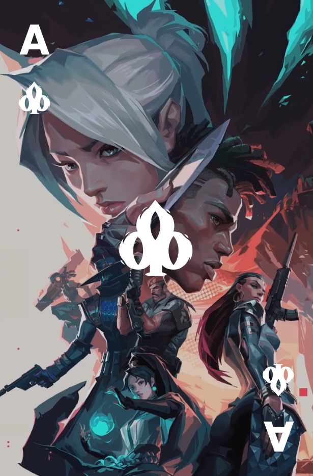
Upon reflection, I made a strategic choice to embrace symbols over a traditional logo. This decision not only made more conceptual sense but also contributed to a heightened sense of unity within the set. Drawing from these successful outcomes, I applied a similar approach to the rest of the design process, mirroring the creative strategy I employed in conceptualizing the ACE.

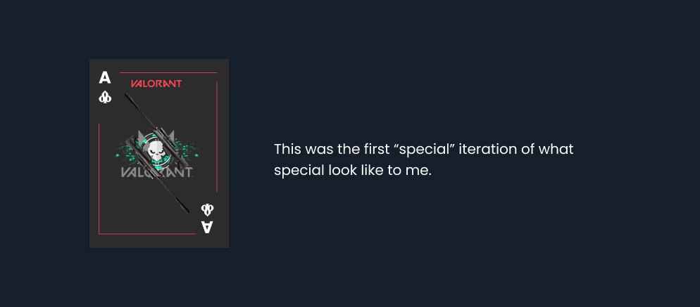
Final ACE iteration
After many iterations, I decided to use card icons instead of using the Valorant logo, it makes more sense and feels more legitimate and cohesive.
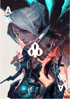
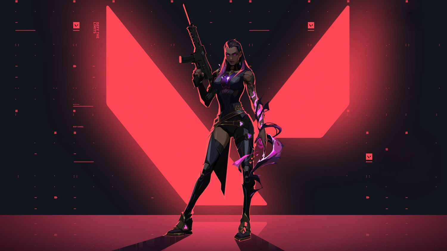
For the ACE, I drew inspiration from its symbolic meaning—a representation of accomplishing a remarkable feat alone, such as eliminating all five players in VALORANT. To capture the essence of "everyone" in the game, I decided to feature diverse characters in the card art.
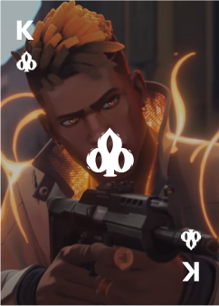
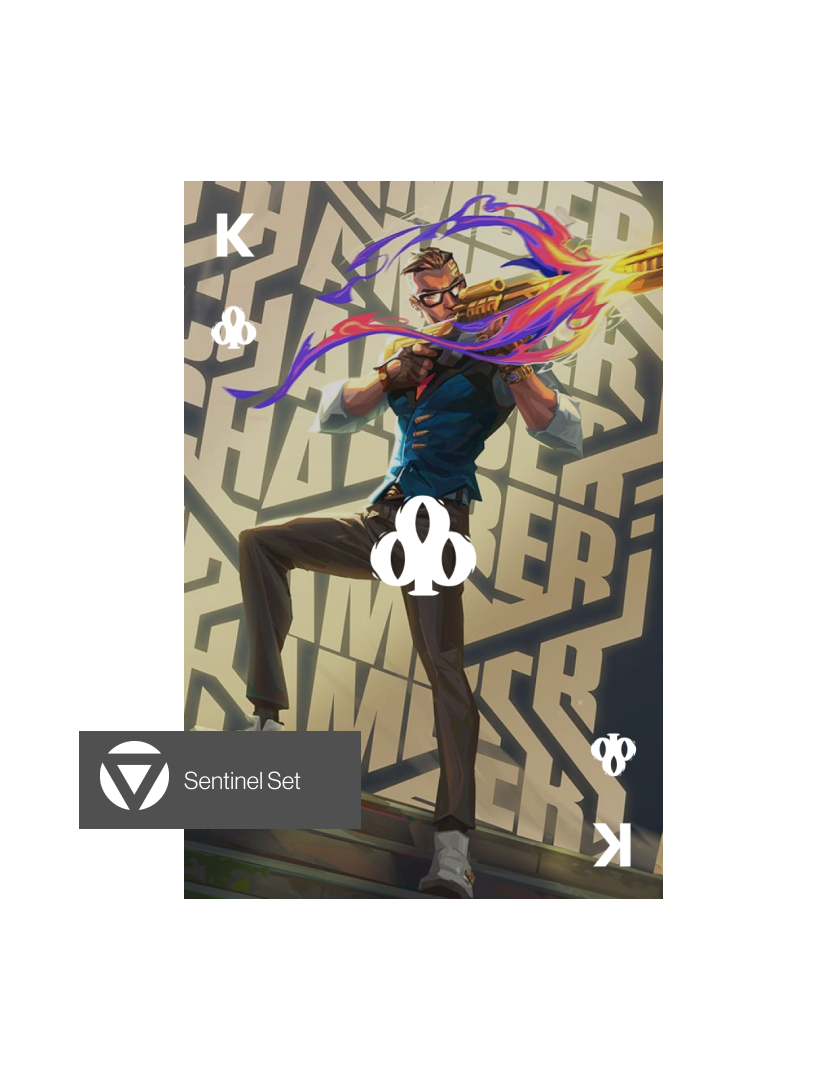
Considering the King, Phoenix emerged as the ideal choice, adorned with a king sticker in the game and holding a prominent role in VALORANT's lore. His presence added a regal touch to the deck, aligning with the hierarchy of playing cards.

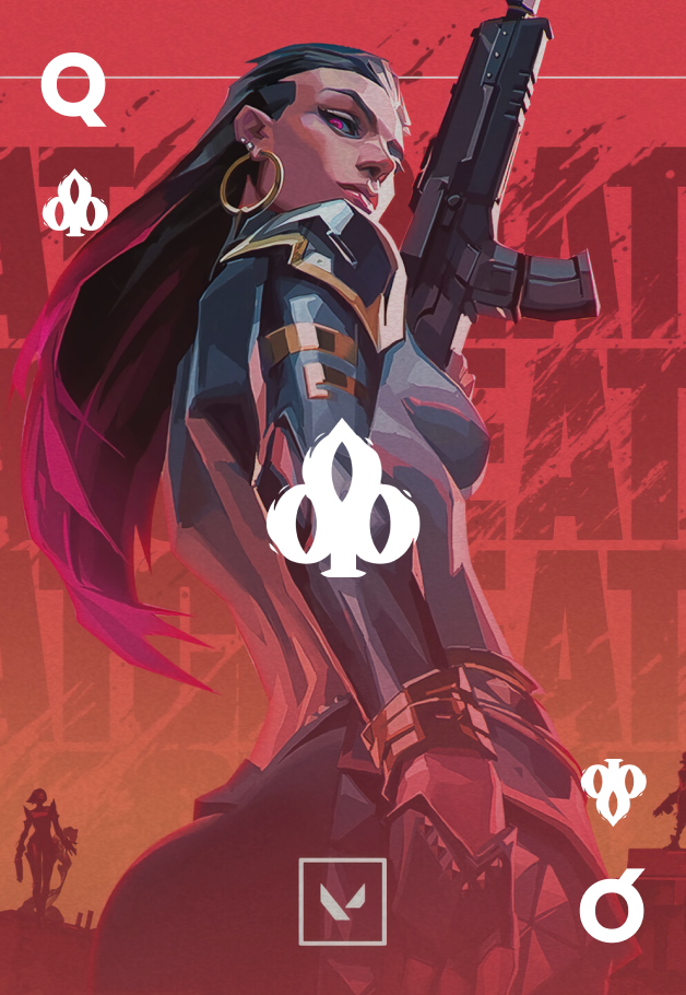
Moving on to the Queen, I delved into the Spanish meaning of "Reyna," which translates to "queen." It led me to the character Reyna, an EMPRESS in the game, embodying the regal qualities associated with a queen. Illustrations of Reyna further enriched the design.
Completing the set, the Jack introduced an intriguing choice. Yoru, a "samurai" from Japan, emerged as the best fit, aligning with the hierarchical structure of playing cards and infusing a unique cultural touch.

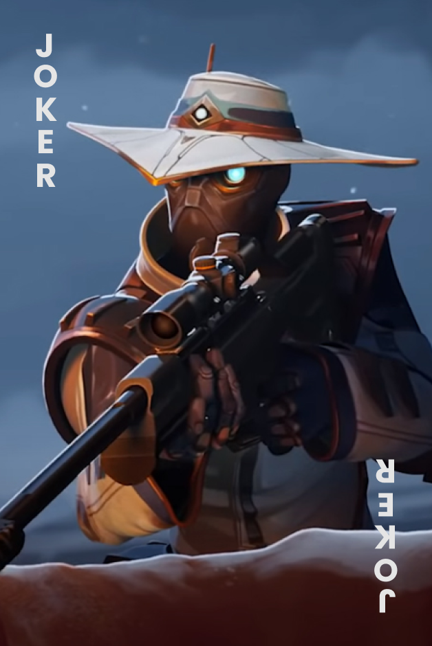
The Joker set brought an element of fun, and for this, I turned to the character "Cypher." Known for his humorous voice lines, Cypher's persona seamlessly matched the playful theme of the Joker.
I underwent multiple iterations before settling on a distinctive pattern. Drawing inspiration from bicycle cardbacks, I aimed for a design that echoed the enigmatic and unconventional aesthetic of playing cards.
This meticulous process resulted in a captivating and harmonious deck of playing cards, where each element was carefully curated to convey a cohesive and visually compelling narrative.
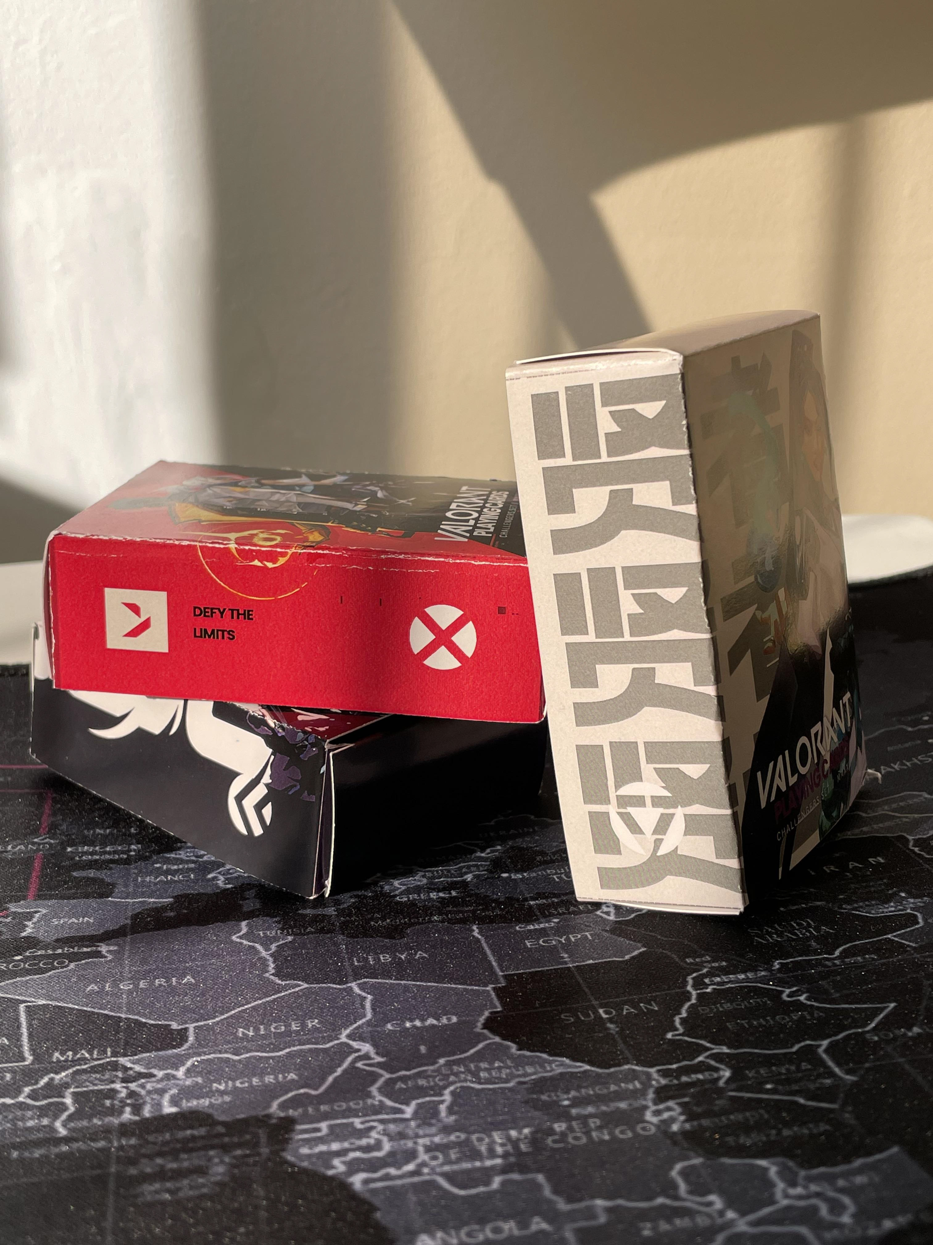
Box Set Design
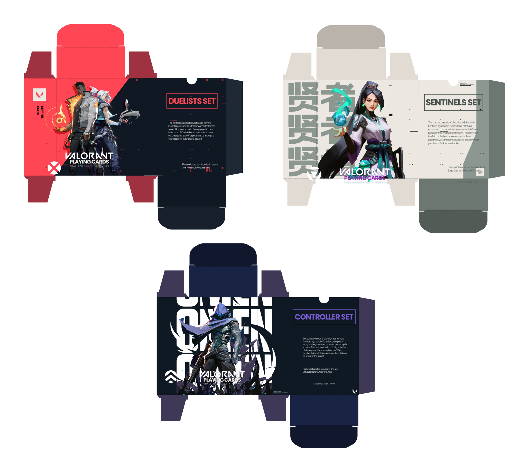
Designed separate themes for Duelists, Controllers, and Sentinels sets.

Selected contrasting colors, inspired by Valorant's palette, for a visually striking box design.
Final Design

Card Faces

Simplified and refined card face designs for a clean and minimalistic look.

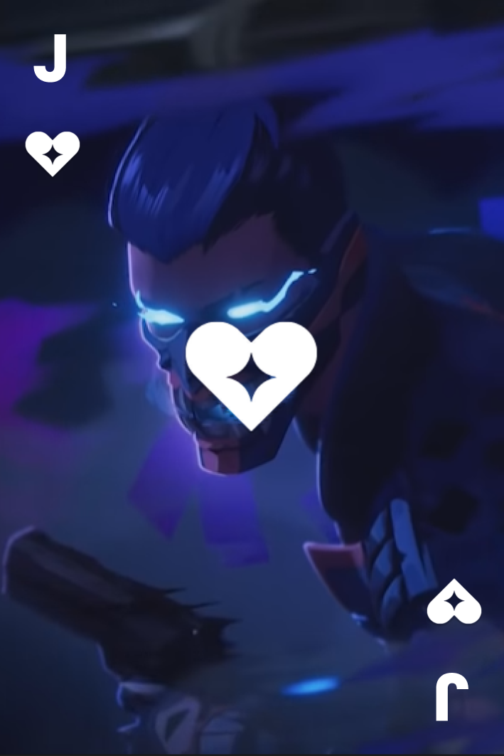

Ensured visual representation of Valorant's characters on the Royal cards.
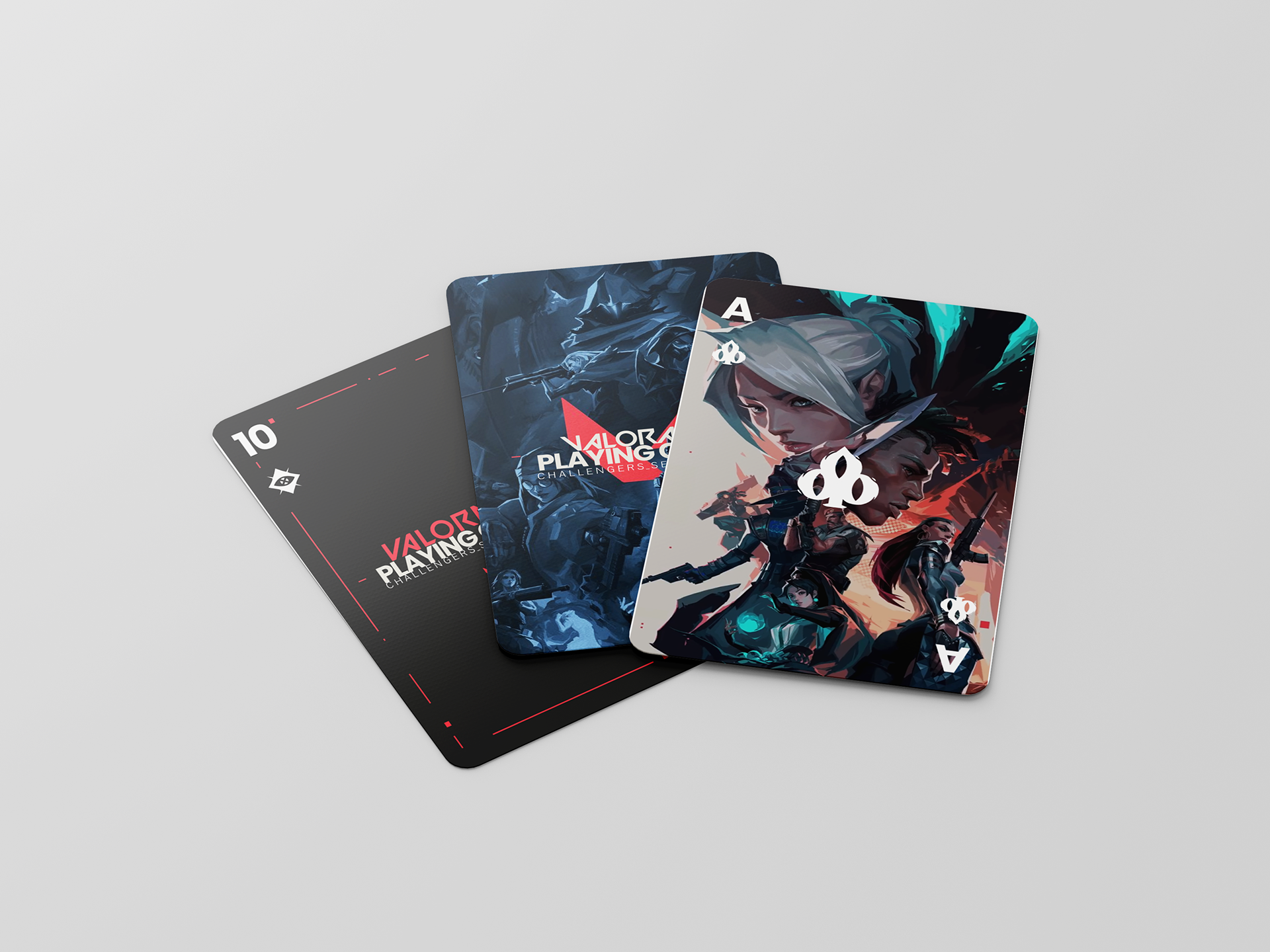
Card Back Design
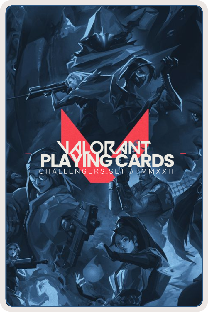
Derived inspiration from traditional bicycle card backs, incorporating a unique pattern.
Box Set

Designed visually cohesive box sets, incorporating thematic elements and unique colors for each category.
Results
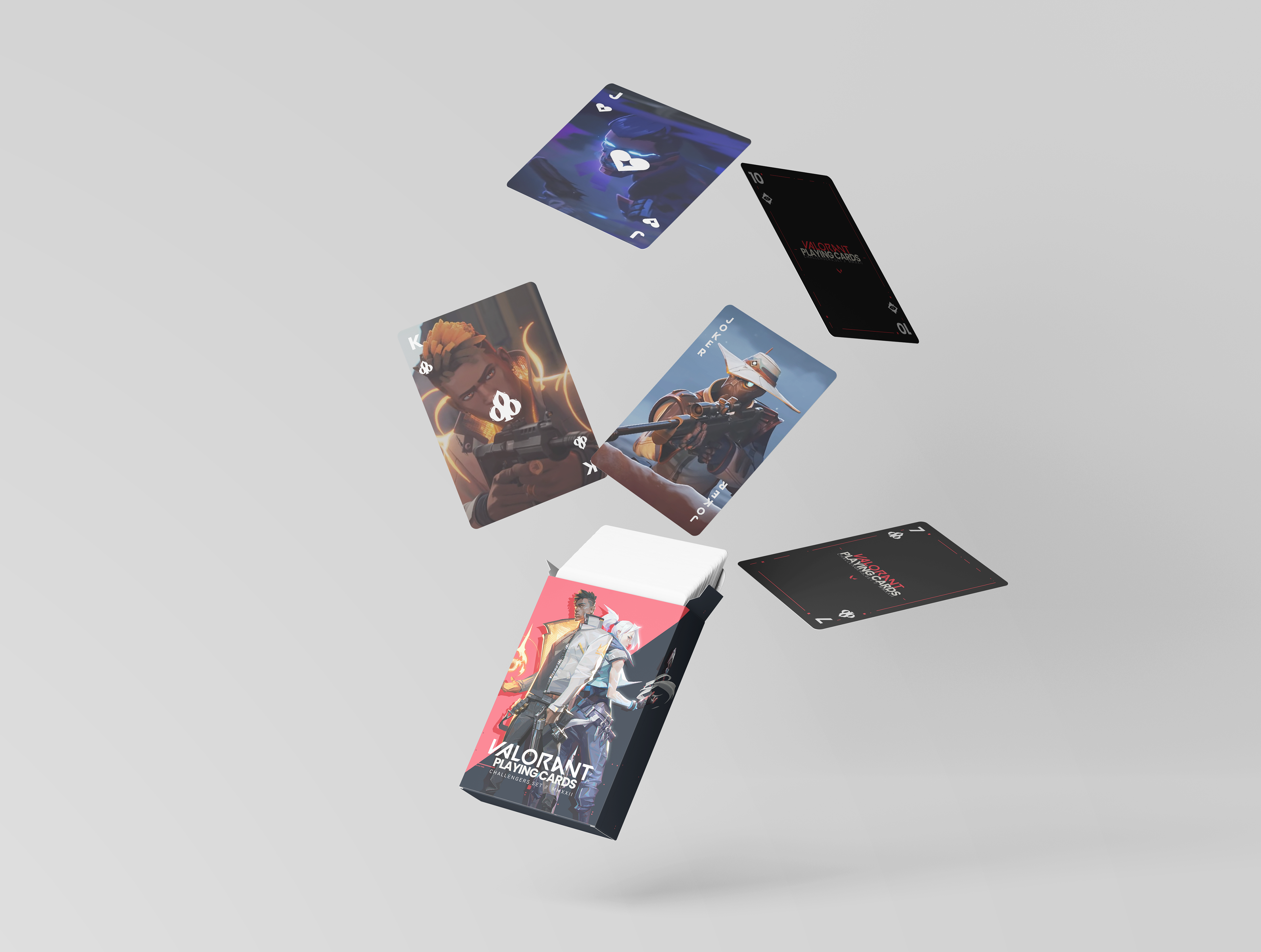
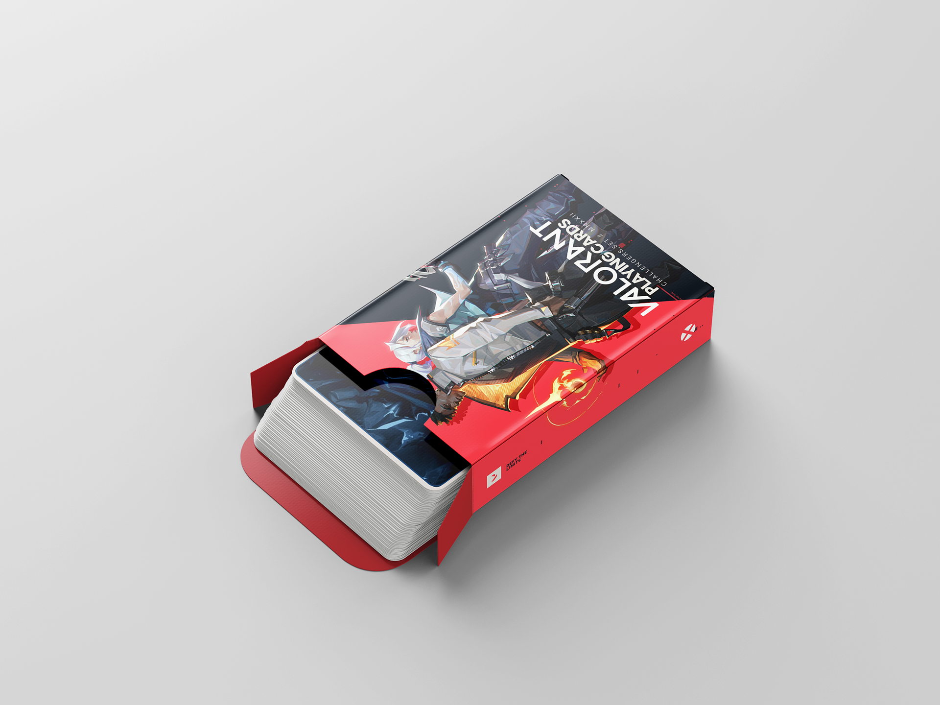
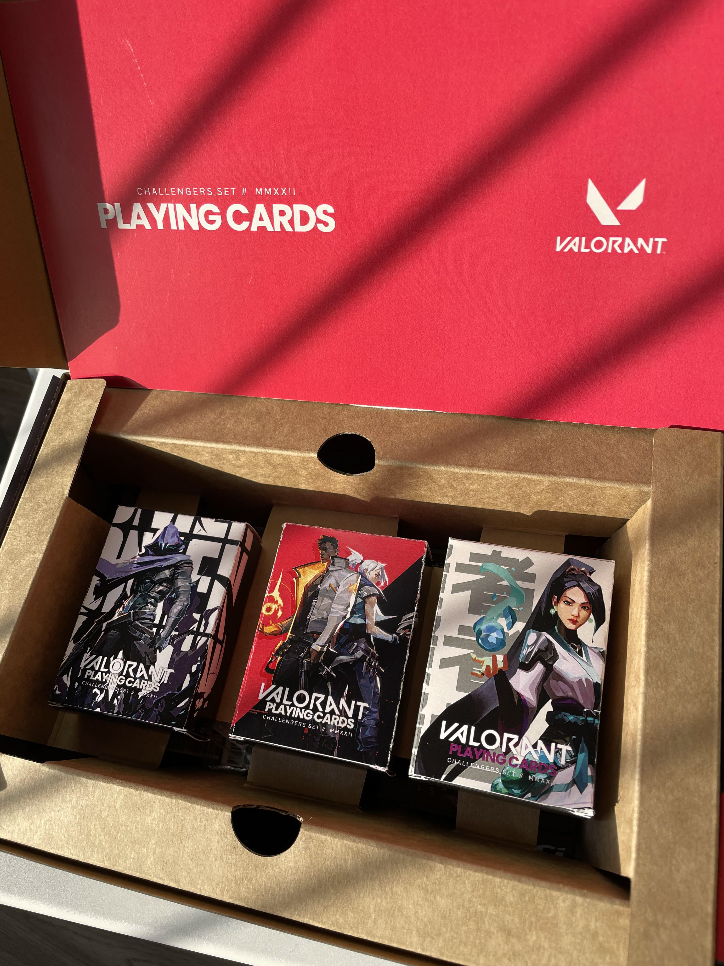
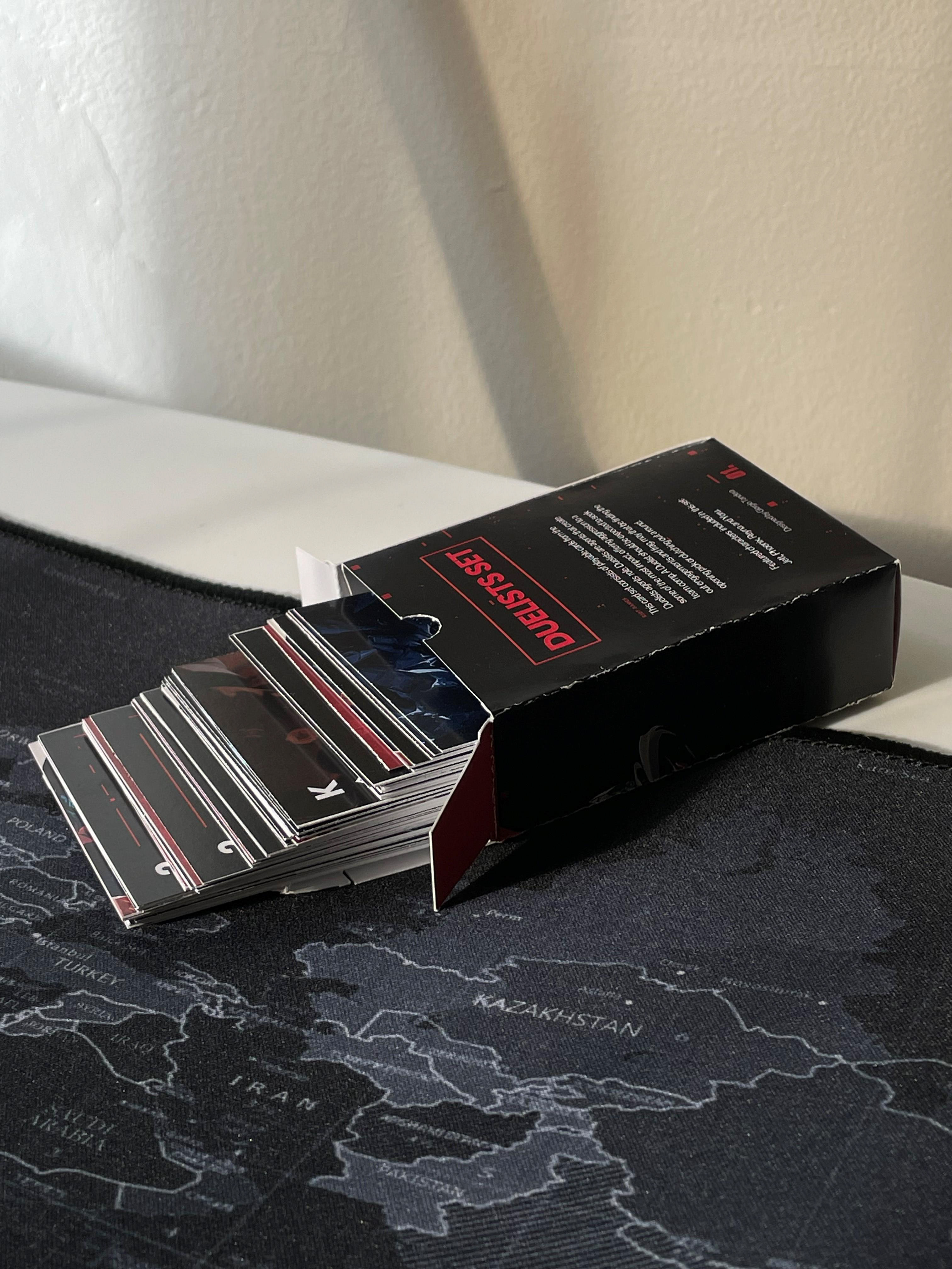
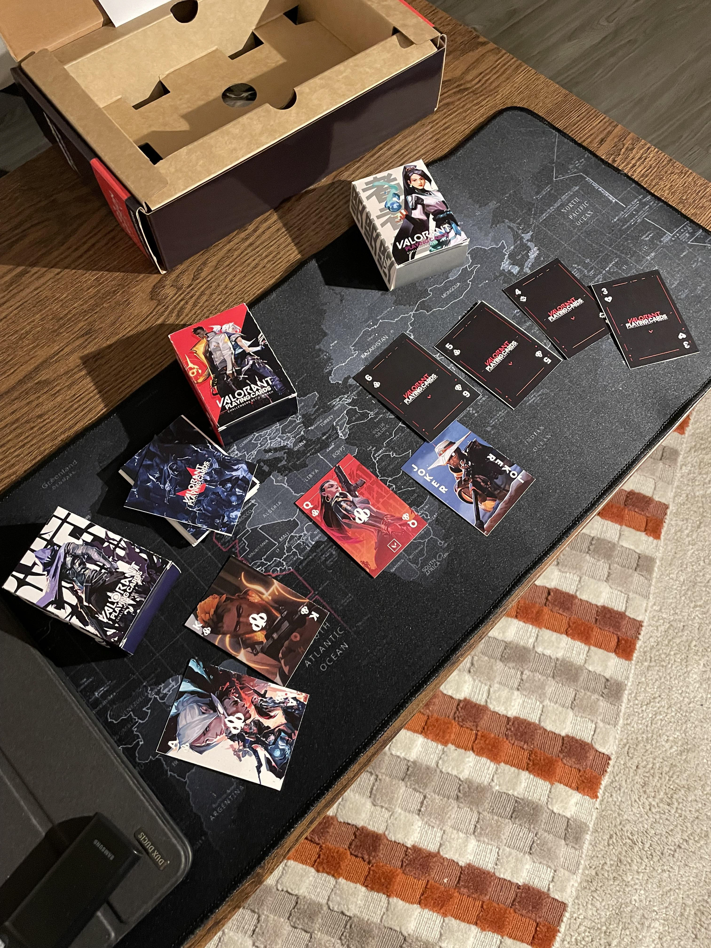
The final design includes a set of playing cards—Heart, Clover, Spades, and Diamond—each intricately crafted from Valorant icons. The box sets are visually appealing, with a thematic connection to Valorant's agent roles.
Future Exploration

I would like to explore more designs on the different role artworks. I did not have time to do 3 roles. I would like also to bring the big box to life.
Reflection


Reflecting on the journey, I successfully transformed in-game icons into a tangible and engaging product. The thematic approach and attention to detail in box set design aim to provide Valorant players with a special and cherished card set.
If I could go back and do things differently, I would have spent more time designing the box so it has a more cohesive and distinct look and feel. I would also like to explore designing the number cards to be more legible.
Some constraint that I faced was designing the icons for the cards, but I am proud of the solution that I thought of. Something that surprised me is that not many game developers have card games as merchandise, I wonder what that would look like.
Future exploration may include actualizing the entire vision, including mixed materials, use of foam, and high-quality production. I would love to see this complete with premium materials.
Thank you for joining me in this design exploration.
Best,
Giorgio Tandera.
Giorgio Tandera.